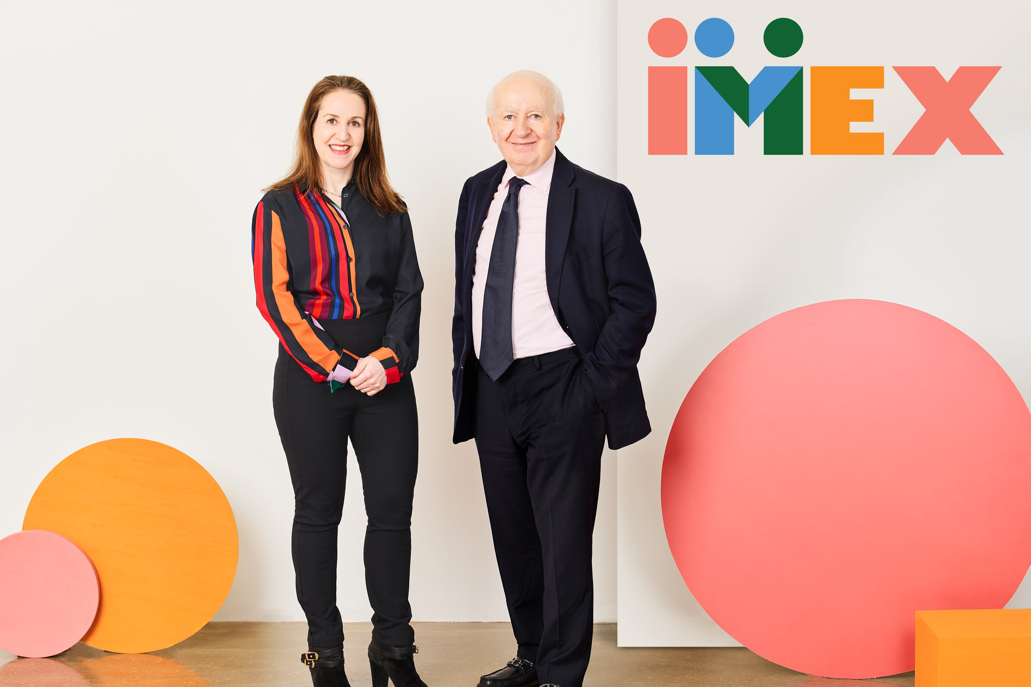
One of the first things Imex Frankfurt attendees will notice online and when they arrive at the show at Messe Frankfurt next week is that some serious shape-shifting has taken place. The Imex team has been working hard behind the scenes for nearly 18 months to design and debut a new visual treatment: a brand refresh, set to go live on Monday, 22 May.
Scrutiny of honest critics
Imex’s in-house design team, led by Design Manager Anna Gyseman, conducted the brand review process. Gyseman was a seminal member of the team that launched Grazia magazine into the UK market. As an “honest critic,” she successfully recruited ex-colleagues Tony Chambers, former Editor and Creative Director of Wallpaper magazine; Suzanne Sykes, award-winning Creative Director, Graphic Designer and Brand Innovator; and Jonathan Clayton-Jones, Creative Director at the Telegraph Group.
Prior to the redesign, Imex, like many companies before it, felt its existing identity no longer reflected the company or its live show experiences. Extensive workshopping with staff revealed a strong loyalty to some aspects of the old brand. However, it was agreed those elements representing people (the classic dots) were a legacy to be built on, not thrown away.
Carina Bauer, Imex Group CEO, explains: “The minute the design team presented the ‘winning’ concept to our staff, we knew they’d nailed it. In clean, contemporary pastel colours derived from our heritage brand, the design embodies the heart, purpose, and business value Imex stands for. It captures our belief in the positive power of people from all over the world meeting eye to eye, face to face, and shaking hands on a business deal or new friendship.
“As with all good designs, we tried to ‘break it’, but it stood up to all our tests. It works brilliantly as part of our show experiences and on our websites, signage and more,” Bauer adds.
Inclusive design thinking
Using the latest inclusive design principles, the team created a soft brown tone affectionately called “Imex biscuit” for use instead of classic white as a background colour. This non-stimulating, neurodiversity-friendly colour makes readability easier for a broader range of people.
First ever Sonic logo
Given the importance of online expression for a global brand, Imex also has a unique sonic logo for the first time. Developed with the help of Brighton, UK-based Buff Motion, the soundtrack cleverly builds anticipation of people coming together for a big event. It knowingly embraces the fact that humans worldwide celebrate community in the same way: with their hands and voices.
Carina Bauer sums up: “We’ve brought our brand to life in various ways throughout the show – the atrium at Messe Frankfurt is the focal point for many of our ‘hero’ pieces. Next week’s Imex Frankfurt is a living showcase for the new look of Imex, and we look forward to seeing how people react.”
Imex Design Manager, Anna Gyseman and UX Designer, Oli Bailey, will share insights into the design process and journey behind the new branding in Imex: Behind the Curtain – Event design and measurement on Thursday, 25 May at Imex Frankfurt.